
Mindful Mending is a therapy practice supporting clients across all ages—children, teens, and adults. Their vision is to create a welcoming space for growth, resilience, and self-discovery—one that honors each person’s individuality and fosters emotional wellness at every stage of life.
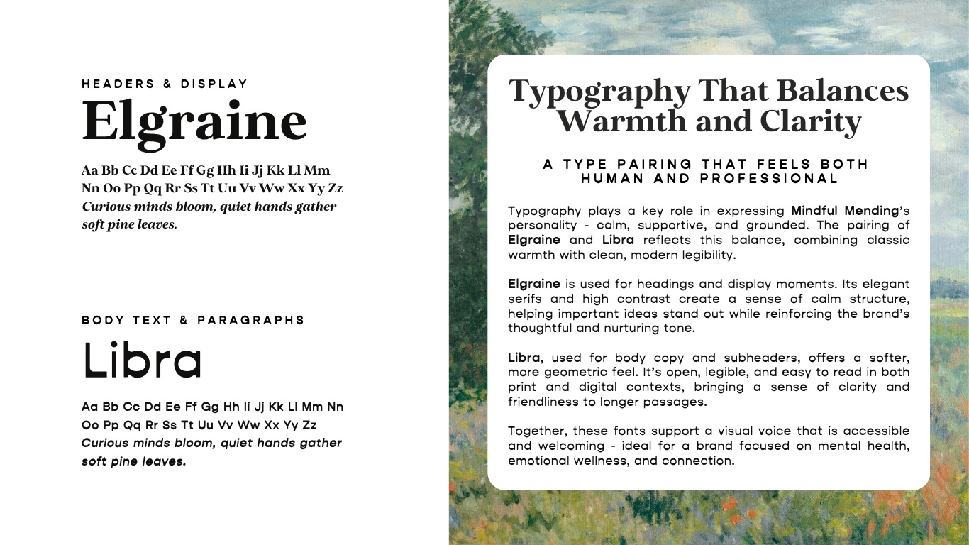
The practice specializes in EMDR (Eye Movement Desensitization and Reprocessing), offering personalized, evidence-based support for clients navigating trauma, anxiety, and emotional challenges. The brand voice is warm, compassionate, and approachable—designed to feel kid-friendly without being childish, while maintaining the professionalism and clarity adults need to feel supported.
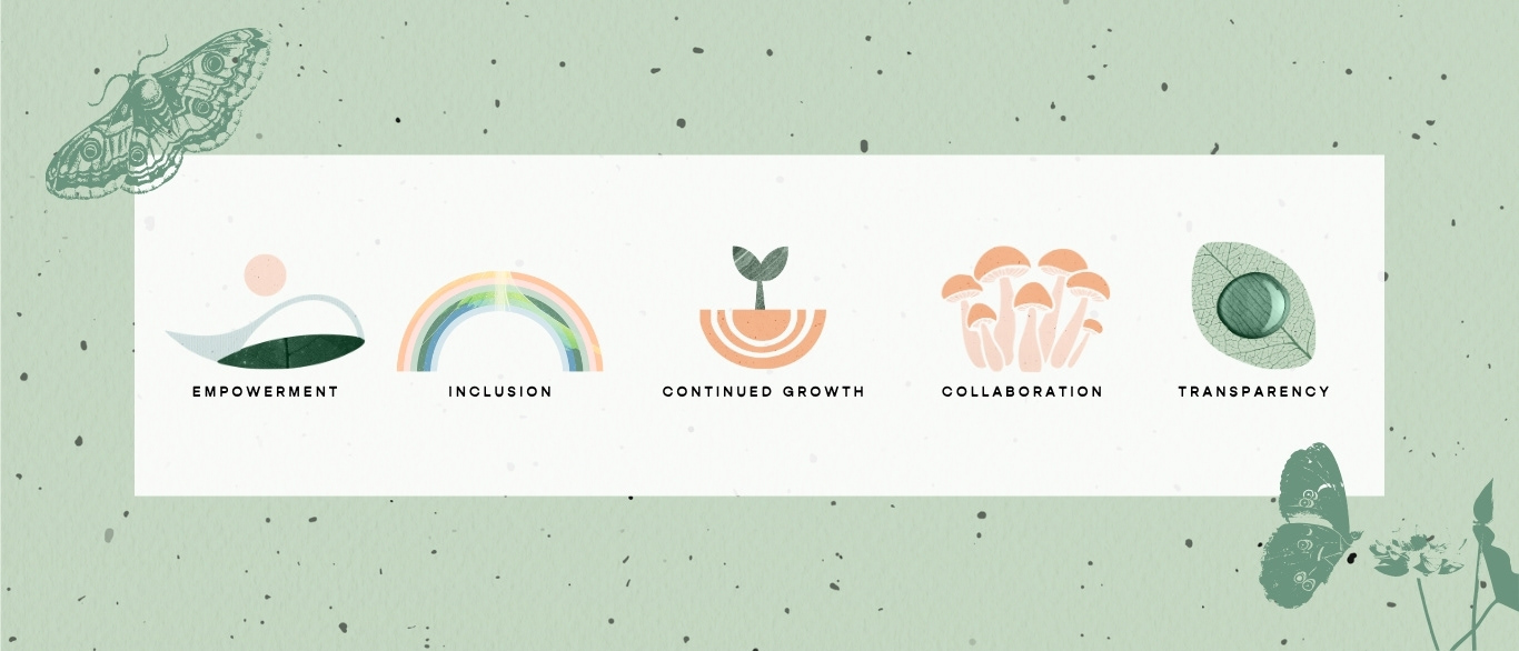
Our goal was to design a visual identity that feels empowering, safe, and deeply human—inviting trust and connection from the very first impression.
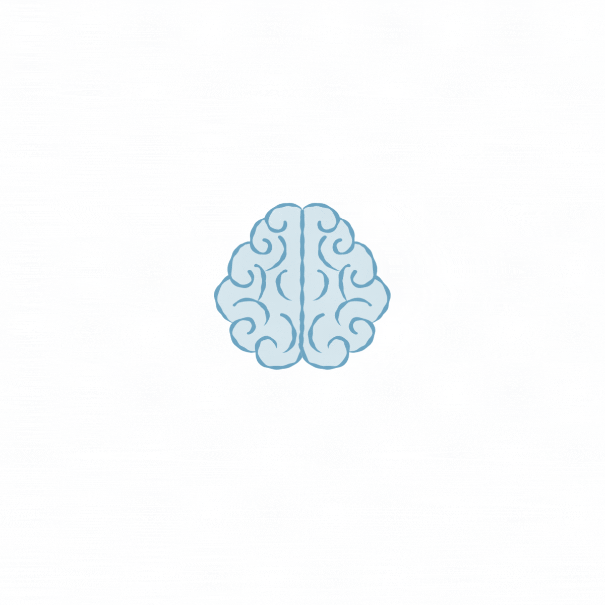
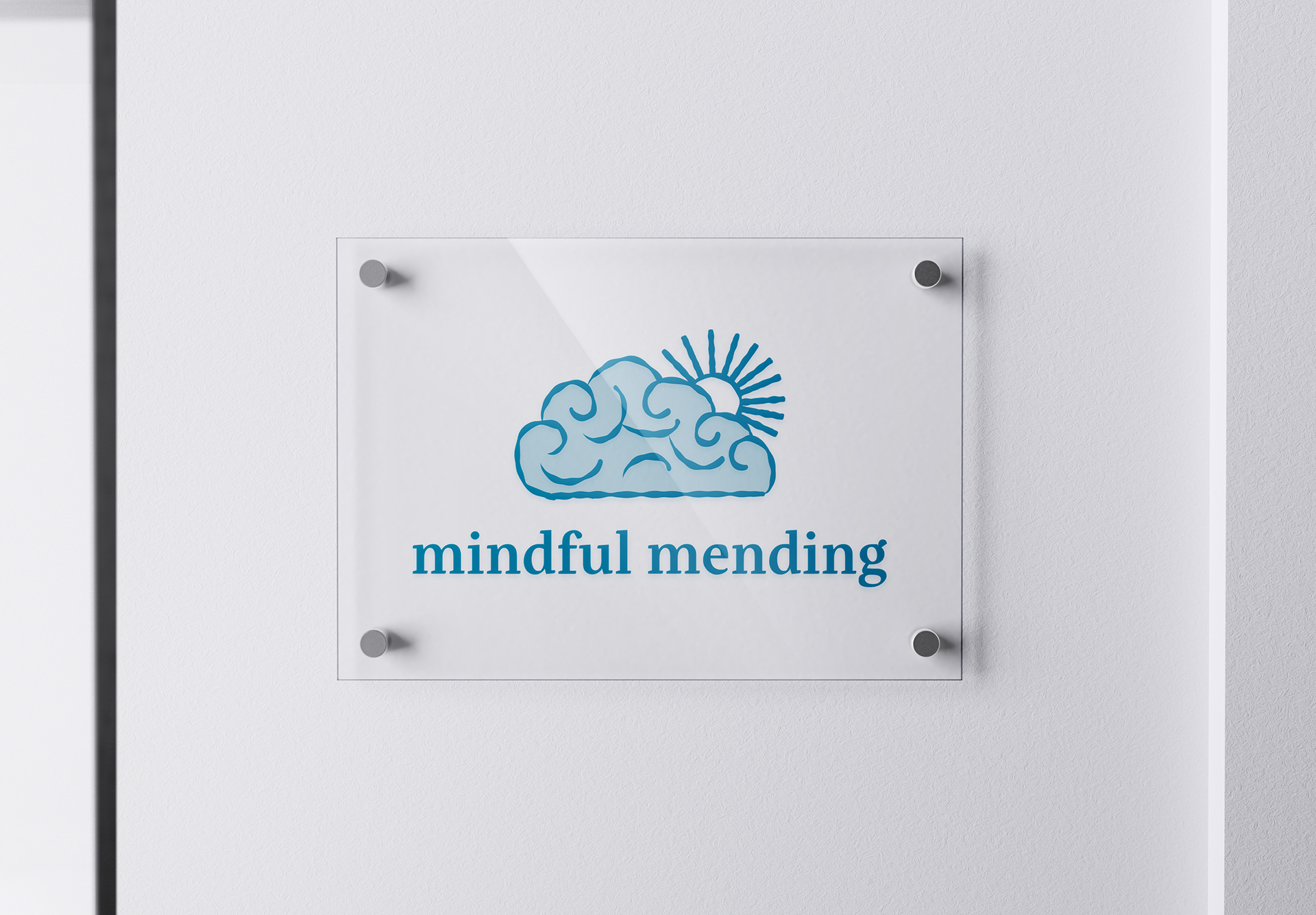
The logo design originated from a simple idea: combining the brain and the eye—a nod to EMDR (Eye Movement Desensitization and Reprocessing), the practice’s specialty. The swirling linework reflects both neural pathways and the rhythmic eye movements used in EMDR therapy, representing the connection between memory, emotion, and healing.
Over time, the shape evolved into a symbol that also resembles a cloud—bringing softness, warmth, and a sense of calm to the brand. That transformation from brain to cloud mirrors the emotional journey of EMDR: from tension to release, from storm to clarity.
It’s a mark that holds complexity and compassion—just like the work Mindful Mending does every day.

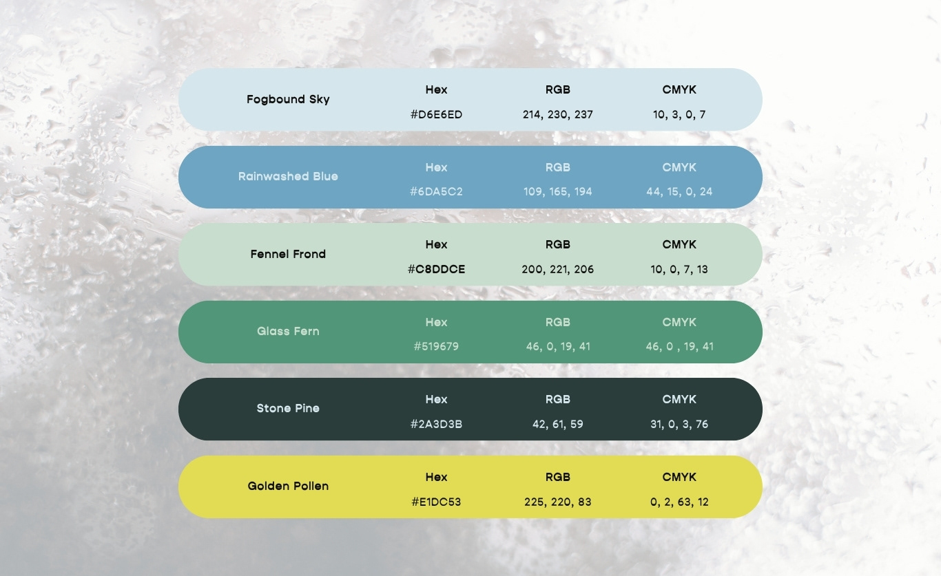
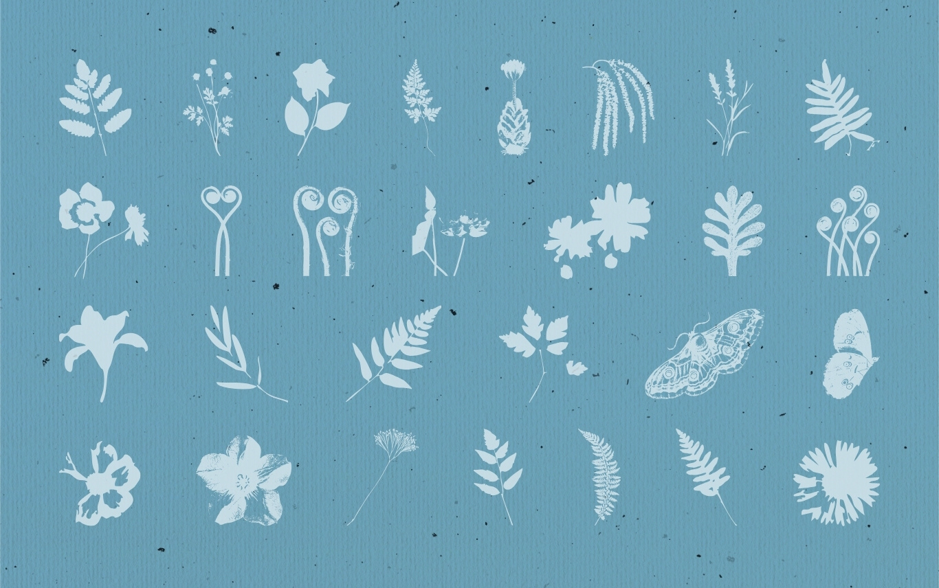
The brand’s visual direction is rooted in themes of gentle healing, nature, and transformation. Inspired by forest textures, textiles, and handcrafted materials, the identity embraces a tactile, arts-and-crafts feel—layered with warmth, curiosity, and care.
Custom graphics, earthy colors, and playful shapes bring a sense of calm imagination to the brand. The aesthetic is designed to feel personal and inviting—especially for families—while still maintaining clarity and professionalism.
To support the visual system, we curated a set of sourced assets including public domain paintings and nature photography. These images were selected for their warmth, softness, and natural textures—reinforcing the brand’s handcrafted, restorative feel. Their inclusion helps keep the brand both visually rich and accessible, while honoring the intention behind every detail.