Primary Logo

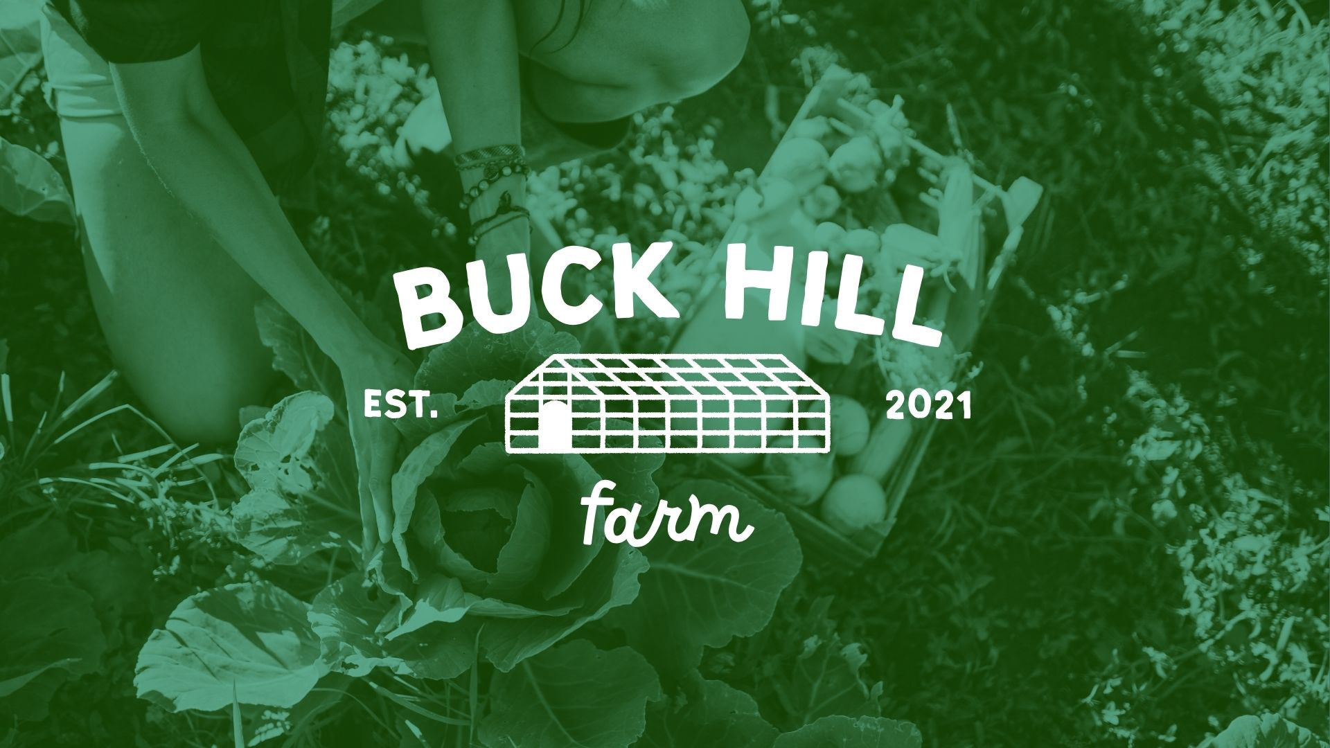
Secondary Logo
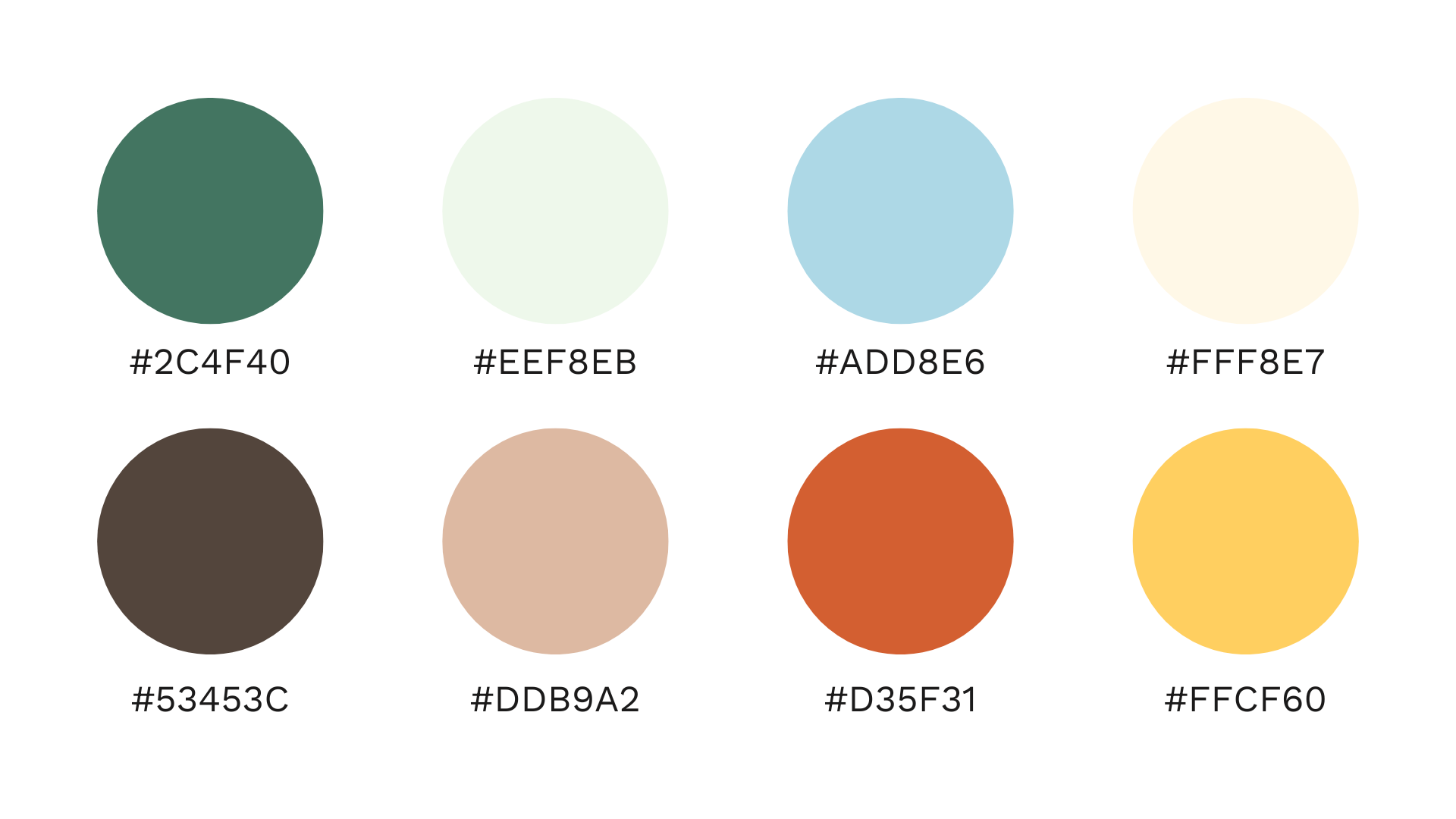
Recommended Brand Colors
Project Overview
Buck Hill Farm, a New Jersey-based greenhouse farm, needed a logo that reflected its values of sustainability, community, and high-quality, hands-on farming. The goal was to create a design that felt organic and welcoming while maintaining a sense of structure and professionalism.
Design Approach
The final logo balances handcrafted charm with a clean, structured look. The greenhouse icon serves as a focal point, emphasizing the farm’s dedication to sustainable, greenhouse-based agriculture. The slightly curved typography adds warmth and approachability, while the hand-drawn lettering reflects the personal, hands-on nature of the farm. The final design captures the hard work, pride, and authenticity behind Buck Hill Farm’s mission.
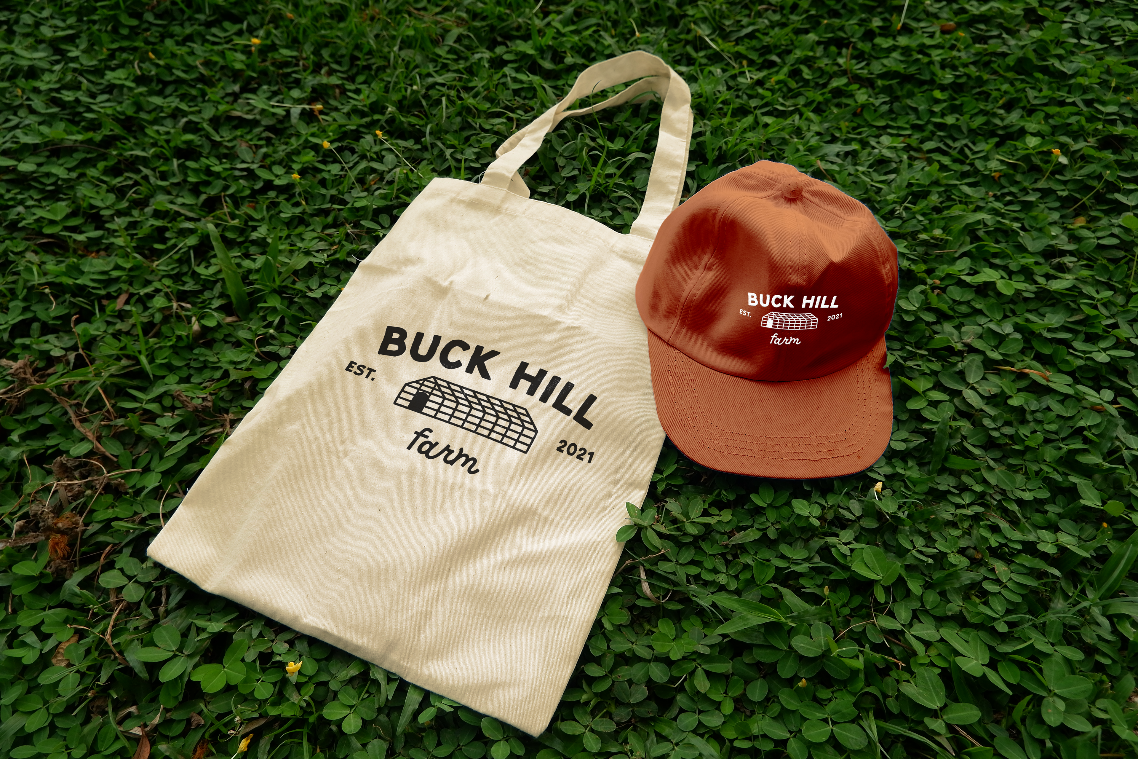
Deliverables
Primary and alternate logo variations
Brand guide detailing logo usage and typography
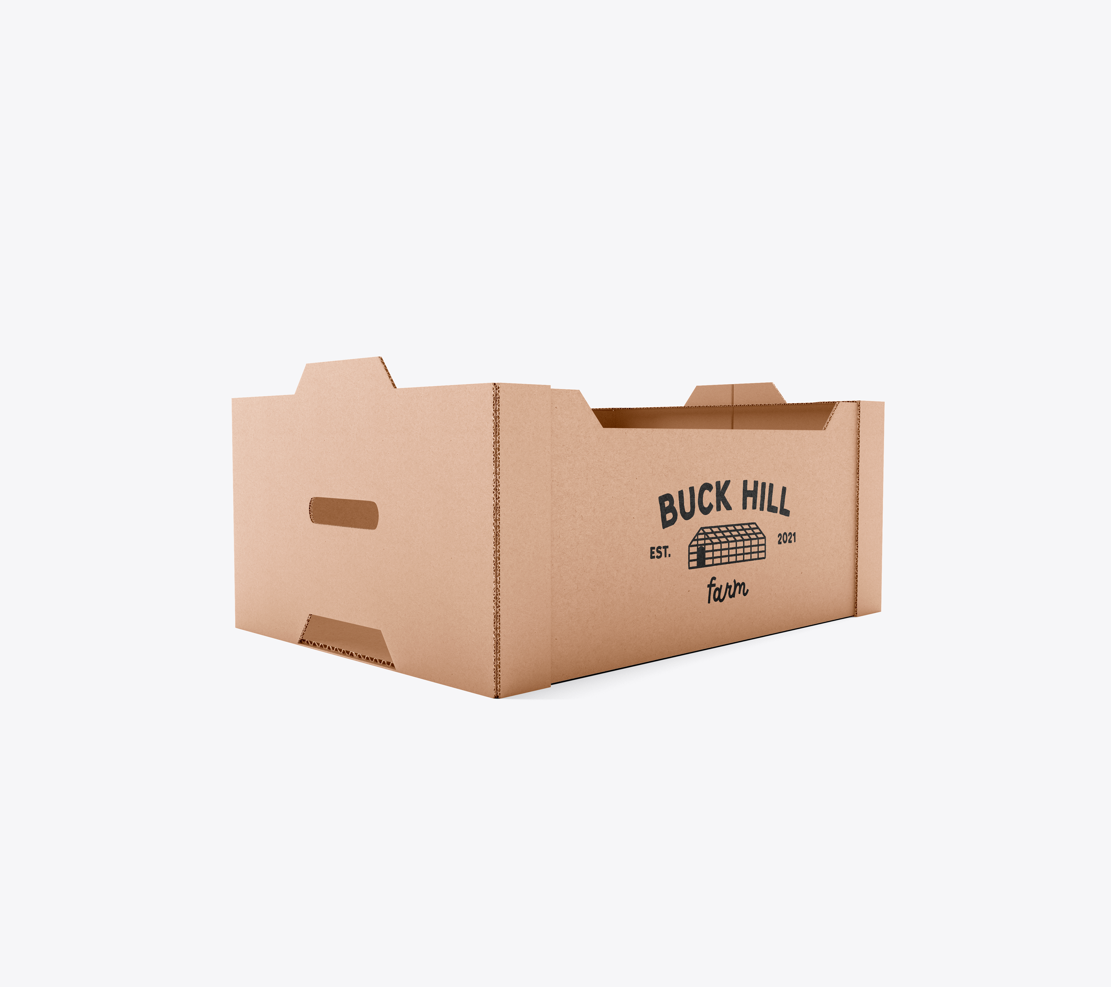
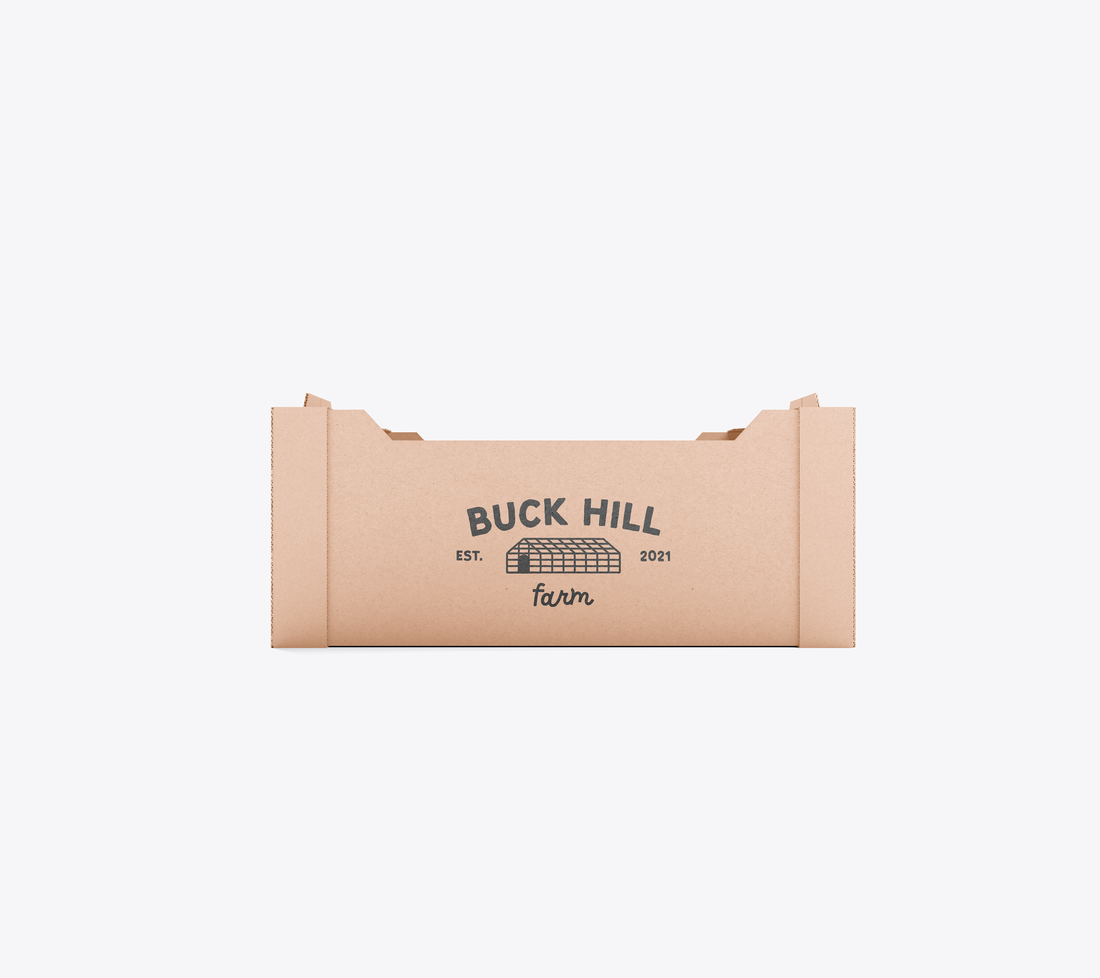
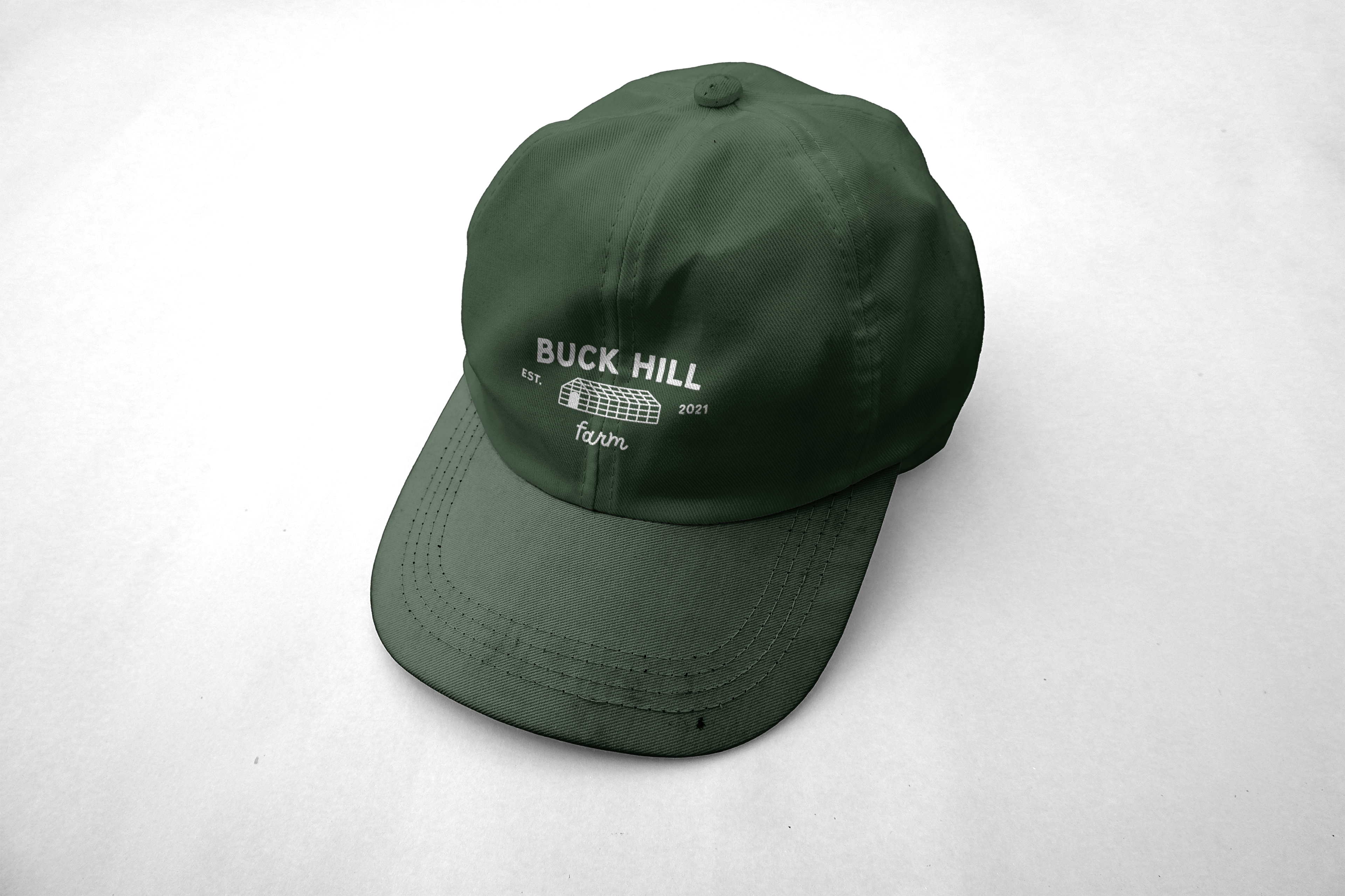
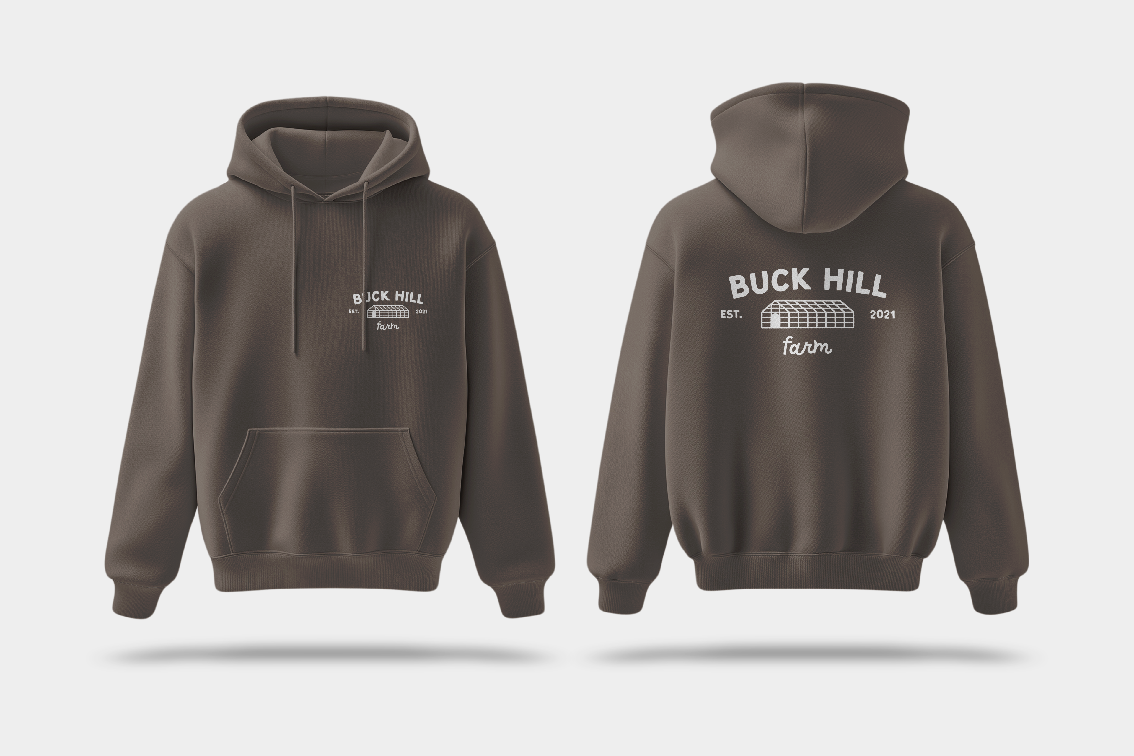
Mockups showcasing the logo across tote bags, apparel, CSA boxes, and more


Outcome
The final design resonated with the client, helping them solidify their brand identity and communicate the value of branding to their business partner. The logo’s versatility allows it to seamlessly integrate across digital and physical applications, ensuring a strong, recognizable presence for Buck Hill Farm.